Our TOP tips for Power BI report design.
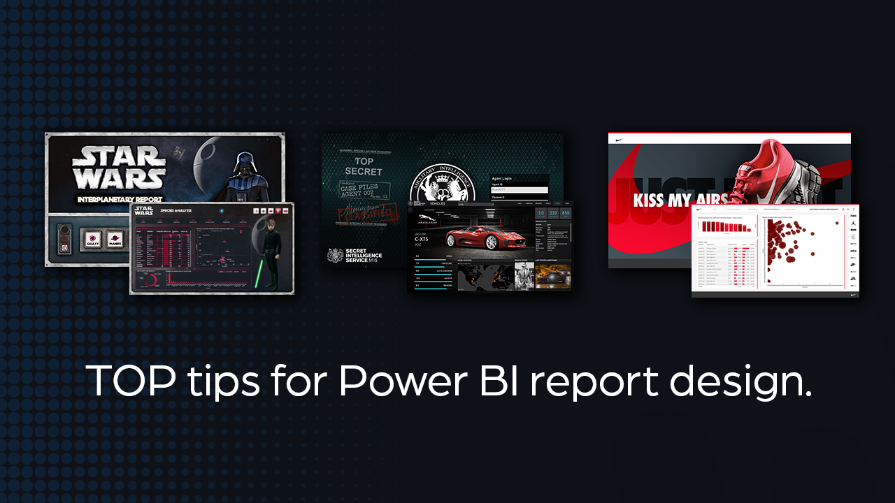
Power BI report design
People ask me what’s my process for Power BI report design?
And the answer is…
It depends!
It is slightly different depending on the project, and things like… is it client work, or for fun? What’s the objective? Are there prescriptive or predictive elements that require CTAs, or should it just be a descriptive report? Who’s the audience? Do they need narratives, or are they data explorers? Plus lots other factors that get flushed out in the discovery phase.
But on every project, there are things I do to make reports (or any UI design) look as good as possible.
So, I’ve created quick list of things I do and the places I go, to work through my design process.
Get Inspired
My process could be grouped into phases that look something like: Discovery & Inspiration, Colour & Content, Layout & Design. Although they look like stepped phases, I’ll revisit each one as and when required if something doesn’t work or I need more content.
All good design (including Power BI report design) starts with inspiration. Regardless of what I think I know, I always get a better understanding of the outcome after I go through some kind of discovery session to gather the content I need to deliver quickly – and that’s the key here. Knowing what the design objectives are, help you deliver faster, better-looking work.
Inspiration
If working for a brand, then the starting point is the companies brand guide. If that is unavailable, then I’ll take apart the website and pick out what I need. I’ll then go to Google and look for UI designs of reports, or website I like. But some of the best stuff I’ve found for report design inspiration are on Behance or Dribbble.
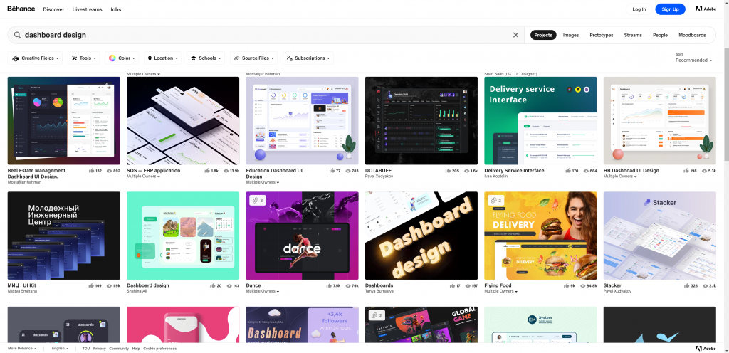
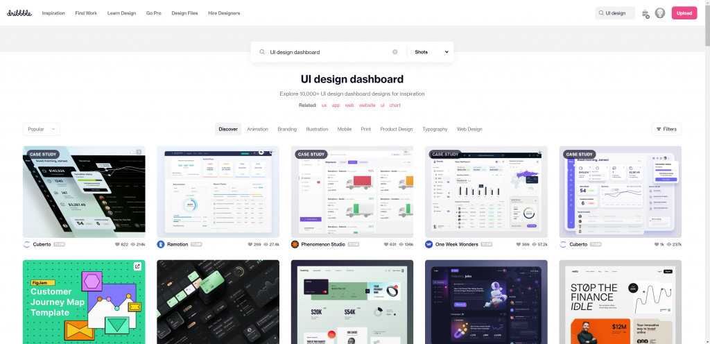
I generally start by creating a folder which acts as a scrap book, and I fill it with things I like that relate to the project.
Colour
Colour is such an important thing and is something I need to figure out before I start any creative work. You need to create your palette, and my favourite place to do this is Coolers. If you have an image (perhaps from step 1) you can upload it to coolers.co and generate a theme. From there you can export it into several formats, including PDF and code ready for your JSON theme.
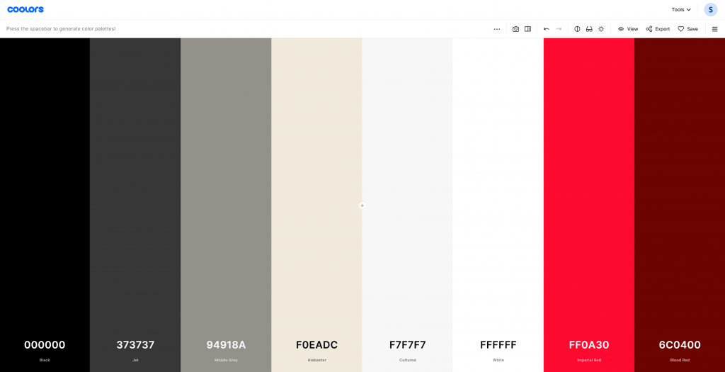
A colour theme created for a Nike Report
Stock Images
Quite often I’ll need images. It could be for impact, or subtle background layers made from patterns or textures. In my Star Wars report I got images of stary skies and nebulas.
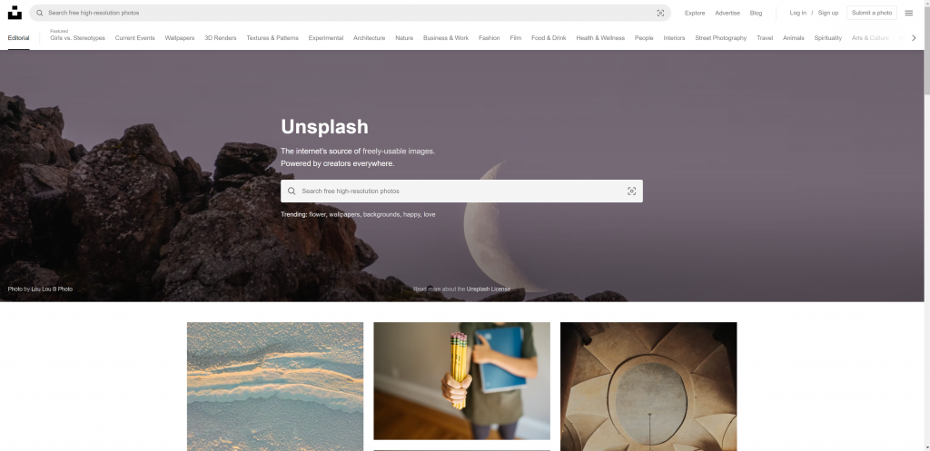
Although I get imagery from many sources, one of the best free places out there is Unsplash.
Stock Graphics
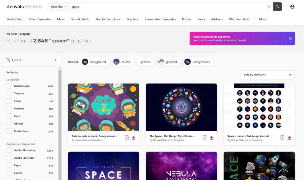
As with photos, I’ll sometimes use stock graphics, icon packs, video, fonts, web templates or more. In the past, I used as many free sites as I could find, but soon realised that you get what you pay for.
So now, I have an Envato account where I’ll get a whole host of design elements to boost my design speed and quality. The monthly fee is well worth the quality you get, and the time it saves.
Icons
Taking time to pick out and style custom icons really makes the difference. It reduces the need for text, makes more use of whitespace, improves usability, and helps the user navigate quicker.
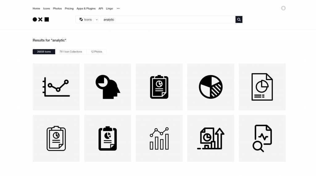
Although I do like icon packs from Envato (as they all have the same style), it’s quite rare you’ll get a pack that has everything you need. In which case I’ll save time and go to The Noun Project.
There you’ll find an icon for everything you can possibly think of.
Design Your Report
Now you got a good set of resources, it’s time to get inside photoshop and start creating – I absolutely love this part.
I’ll open photoshop, create a 1920×1080 (HD widescreen) canvas and start making layouts, starting with a cover, interface and then the detail.
If you don’t have photoshop, then you can use a free design app like Gimp https://www.gimp.org/, or even simpler – use PowerPoint.
Always use a grid!
Take some tips from website designers and use a grid system!
I generally use two grids to layout my reports horizontal and vertical space with guides in Photoshop.
- Responsive Grid Design – take note from website UI design, they’ve spent 30+ years perfecting this art, and it works. Get a grid system image that works for your project (6, 12, 24 columns I find are best) and start to work with it.
https://medium.muz.li/responsive-grid-design-ultimate-guide-7aa41ca7892
- Golden ratio (1.618) – the same math that makes nature and Greek architecture look good, can help your report design also. It’s used everywhere from book sizes to tv screens, architecture, shells, broccoli, and galaxies. Yep, really!
Although I use this less, it is worth knowing about it.
https://uxdesign.cc/design-system-based-on-the-golden-ratio-ui-%C9%B8-e45eb98655cb
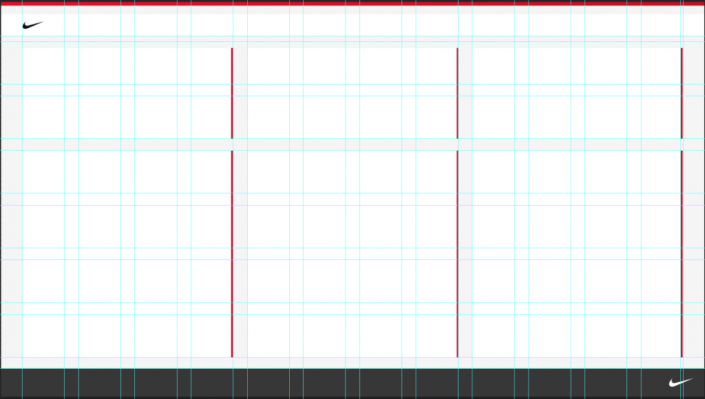
Here’s an example of a grid layout in Photoshop using 12 columns.
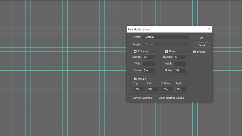
When laying out my grid, I’ll think about leaving whitespace between elements and nice margins, gutters etc, and finally space for the navigation.
Here a look at a layout I’ve been working for a report using the same grid as above and the colours from the coolers example above.
Next up. Development
That’s it, once you have all this set up, you’ll smashing through your Power BI report design.
After this, practise makes perfect, so to continue your learning, read more about UI/UX design and you’ll be on your way to better looking reports.
If you think my list is missing anything, please reach out, as I’m always looking for new tricks.
Or reach out to connect with me.
by Matthew Spuffard – matt@baseone.uk
Latest posts
Latest insights.
Explore the transformative data analytics trends of 2024 that are reshaping businesses. Discover how augmented analytics, AI, real-time data, and more can drive your organization's success.
Discover how Power BI's visualization tools can transform predictive analytics into actionable insights. Learn about interactive dashboards, custom visuals, and real-time data visualization in Power BI.

