Supercharge your report design with our favourite visuals from the Power BI Marketplace.
Visuals from the Power BI Marketplace
I love to try new stuff and learn something new! Every so often, I explore visuals from the Power BI marketplace to enrich my reports, helping me deliver better looking products.
Bar charts, lines and scatter plots are essential visuals that provide the foundations of any good report. But for me, creativity comes from trying new things, and it’s fun to present data in a more exciting way.
As long as it makes sense!
Going outside the box is an effective way to create a visual hook and create better visual engagement for a report.
With all visual design, whether it’s websites, presentations, or dashboards, the first challenge is to get people interested enough to use it. In website marketing, we have metrics such as bounce rate, and A/B testing to try out what works and what doesn’t. Angled toward the goal of getting the user to spend as much time on site as possible.
Our goal isn’t to keep people on a report, but to ensure the information is insightful enough that it aids decision making. But it also needs to be interesting enough to ensure that bounce rates are low. After all, you want users to engage, spend enough time to make sense of the numbers, and return to consume all that lovely data! Then they will start to return true value from the analytics.
That’s not to say design is more important than the information the report delivers, but if you can get a balance, then you’re onto a winner.
I’m always itching to get to the design phase, but with client work, always start with the objectives. At baseone we have 6 phases, and report authoring (where the design happens) is fourth.
For the report authoring phase, I’ll start outlining what design elements I need to put in place to make my work look like my clients brand.
This means I’ll find out about the following things.
- Brand & theme.
- Backgrounds
- Typography
- Iconography
- Style Guides
- Imagery
- Photo & Graphic Stock
Once I have an idea of the visuals needed to deliver the objectives, I’ll think of ways to bring the report to life and try to build it. Which is not always the easy part.
So, here’s my list of visuals from the Power BI Marketplace I tend to use, with examples.
Simple Image
Vincent Faigt
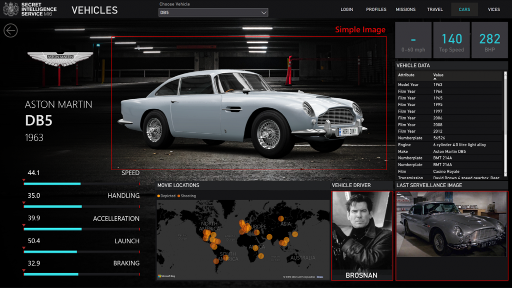
They say a picture is worth a thousand words, and in data visualisation that is true for charts. But good brand imagery works wonders for enriching a report, as you definitely eat with your eyes.
Clean backgrounds work best, with well thought out UI, and it helps to think about the user journey a little too. Then you can look at dynamic imagery (images that changes with data interaction). And this is where this visual comes in handy.
I’ve tried all the image visualisations, but my go-to are the simple ones. And this one just works!
Add a data field for an image URL into this vis and voila, you have your image in Power BI.
Cons: It doesn’t like having two images the same on one page, it displays both as blank, but it’s rare that you would encounter this.
Check it out here.
https://appsource.microsoft.com/en-us/product/power-bi-visuals/WA104381835
Text Enhancer
Maq Software
 One thing that is lacking in Power BI is typography. Not only the selection of fonts, but also the styling options and the visuals to support text.
Ok, so I know it’s a data vis tool, and I like Segoe UI, and DIN fonts, but I need a little spice in my life from time to time.
The Text Enhancer visual by MAQ software helps you take your text a little further.
It still only offers the built-in fonts, but gives you many more options such as
- Prefix and Suffixes
- Skew options
- Word & letter spacing
- Perspective options
- Text transforms
It is much better than the inbuilt text or card vis you have in power BI.
Check it out here.
https://appsource.microsoft.com/en-us/product/power-bi-visuals/WA104381762
Chiclet Slicer
Microsoft
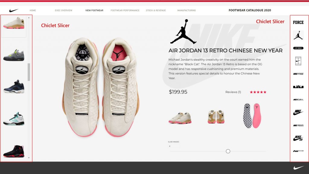
 If you’ve been looking for a better, more visual way to let users slice up your data, then look no further than the chiclet slicer from Microsoft.
Why it isn’t a native visual in Power BI I’m not sure. But it is great.
Assign images to your dimensions, and your good to go. I’ve used this in loads of reports, and it makes a massive difference.
It comes with a whole load of customisable features including backgrounds, colours, and other great options to help you provide a layer of visual appeal to your reports and move away from the standard text slicers.
Check it out here.
https://appsource.microsoft.com/en-us/product/power-bi-visuals/WA104380756
Map Box
MapBox
 I love a good map! And I also like to make my map fit my design theme.
MapBox, alongside other tools allow you to create great mapping solutions & choropleths.
If you use this visual, you’ll need a free MapBox account (you’ll need one for the map key).
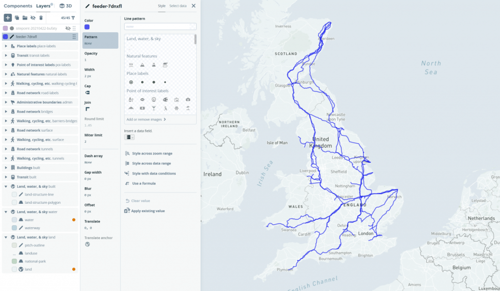
Once your signed up to MapBox, you can use their studio to create custom map styles and edit everything from road colours to the level of detail visible.
Additionally, you can add custom shape layers and interact with them in Power BI. It is super powerful but can take some time to set up.
The only limitation I have found, is that you cannot have custom tooltip popups. But otherwise, you’ll get bonus points when your report has a bespoke mapping solution.
It is also worth noting that MapBox do not currently support the Power BI app, so if you get stuck, you’re on your own.
Here’s a map created in Map Box studio using a custom tile set layer overlaid.
Get the visual here
https://appsource.microsoft.com/en-us/product/power-bi-visuals/WA104381472
Xviz Gantt Chart
xViz
 I’ve spent most of my career as a project planner on large projects, where huge Gantt charts and detailed reporting was daily routine! And is where I started automating my reporting using excel.
Because of my background, many of my clients are in Project Controls. So, you could say I know a good Gantt chart when I see one.
After extensive experimentation with Gantts that are available for Power BI, my favourite by far, is the xViz Gantt chart.
It pretty much does it all! Baselines, progress, resource, customisable colours, and hierarchy layouts. It is super awesome!
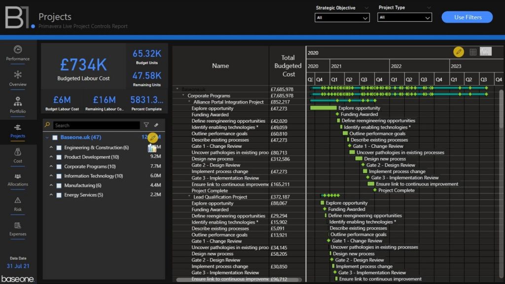
If you use Primavera P6, or Microsoft Project and you need to incorporate your data into Power BI, then the xViz Gantt Chart’s features are spot on!
It has a free tier which will get you going, but it does get expensive if your report has a lot of users. As the pricing plan charges per viewer.
xViz have a bunch of very well-made visuals, so be sure to check them out.
https://appsource.microsoft.com/en-us/product/power-bi-visuals/WA200000891
HTML & CSS Viewer
BI Samuri
 I thought I’d save the best for last. Not because it’s better than any others in this list, but because the possibilities for this visual are huge.
Using HTML and CSS, you can style and create (almost) anything you can find on the web.
The coolest things about it, is that you can use DAX variables and inject them into the HTML code. This enables you to create dynamic features for your Power BI report.
- You can import Google fonts
- Style dynamic text
- Insert animations
- Insert a webpage
- Create dynamic backgrounds
- Manipulate images
- And so much more.
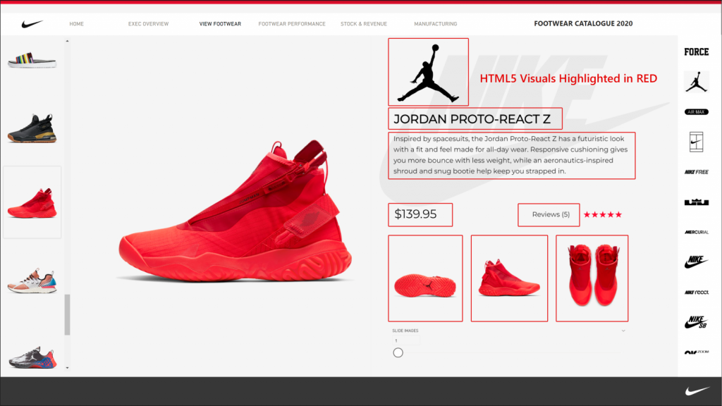
Below is an image from my Nike report showing the HTML visuals highlighted in red.
There are a few options on the Power BI store for HTML, but my favourite is the BI Samuri visual.
I’m using this all the time because of incredible features, such as.
- Seperated CSS & HTML
- Scaling ability
- Scroll bar hide option
- Lots more.
I have also found that it renders HTML and CSS better than the others out there.
I’m still experimenting with HTML in Power BI, but it is finding its way into all my new reports. So, the best is yet to come.
Also check out my previous post showing animated text transforms using CSS to get a Star Wars into text effect.
https://www.linkedin.com/feed/update/urn:li:activity:6972526306378801152/
Check it out the visual here.
https://appsource.microsoft.com/en-us/product/power-bi-visuals/kteamsolutionsgmbh1585769979285.htmlcssjsviewer
What about the charts?
Have I left you wondering “where are all the charts?”
Thats a list for another day.
I generally stick to the standard bars, lines and scatters included in Power BI. They are the visuals that people can read, understand, and interpret the fastest.
We’re not looking to confuse users and force them to try to work out what the strange new chart is trying to tell them.
But if you’re looking to move your reports up a notch or two, then go check out some of the visuals from the Power BI Marketplace mentioned above.
Please let me know what your favourite visuals from the Power BI Marketplace are so I can try them out too.
by Matthew Spuffard – matt@baseone.uk
Latest posts
Latest insights.
Explore the transformative data analytics trends of 2024 that are reshaping businesses. Discover how augmented analytics, AI, real-time data, and more can drive your organization's success.
Discover how Power BI's visualization tools can transform predictive analytics into actionable insights. Learn about interactive dashboards, custom visuals, and real-time data visualization in Power BI.

