How to design a Logo: The thought that goes into superior brand design
How to design a Logo.
The thought process and meaning of our brilliant new brand.
Designing a good logo is a mission of discovery. It requires a deep understanding of an organisation, the team, and the values it represents. Then, the ability to transform those values into something that symbolises its meaning.
If you were asked to write down your top five favourite logos and five that you didn’t like, what would they be? I bet if you looked at those results across a large demographic, you’d see a lot of similarities.
But did you ever wonder what makes a logo good? Why does it resonate with you, and what makes it stick in your mind?
The science and psychology of design and how it affects us at a human level is fascinating, and understanding it is a sure route to better design.
At baseone, we’ve been working on a new brand. This article uses our new logo as an example to show the kind of thinking that goes into effective design. Or in this case, a redesign.
This journey was great for us to learn about our brand. I hope that if you need a logo in the future, by reading this, you’ll know what to expect, and how to design a logo.
Logo science.
There’s more to logo design than text, icons, shapes and colour. As with everything, understanding the science behind it is extremely powerful, and helps us to focus on what matters.
Knowing this helps you understand how to design a logo from scratch, appreciate what makes a great logo great, and a bad one bad.
ARMMed and dangerous.
Our brains make all our decisions for us, either consciously or subconsciously. So, we need to design for the brain. And in logo design, that’s where the acronym ARMM comes in.
ARMM is an approach to evaluating and designing effective logos based on tried-and-true principles of psychology developed by Professor William Lidwell who wrote the Universal Principles of Design. (If you have LinkedIn learning, check out his videos, they are the only videos on the platform I’ve watched repeatedly.)
ARMM states a great logo is effective when it triggers the following four cognitive events in order.
- A – Attention – An effective logo grabs attention. If it doesn’t then it will quickly be forgotten amongst the competition.
- R – Response – An effective logo should stir up an emotional response. People should like it at a gut level without thinking about it.
- M – Meaning – An effective logo expresses meaning. Logos represent organisational values, so it’s important that the design express the meaning associated with it.
- M – Memory – An effective logo is easy to recognise and recall. If people can’t, then you’ve got no chance of standing out in a crowded world.
How high a logo scores across ARMM categories is a great way to predict its effectiveness. If it doesn’t score well across the ARMM categories, it won’t be effective.
Propositional Density
To help improve design, and measure a logos effectiveness, you can use a principle called propositional density. Put simply, it is the amount of information or meaning that can be stuffed into a design using the fewest design elements.
There are two types, or propositions – surface propositions and deep propositions.
- Surface propositions – describe the visible elements of the logo.
- Deep propositions – describe the underlying symbolic meanings of a logo.
Propositional density is calculated by dividing the total deep propositions by the number of surface propositions.
Or, the amount of meaning divided by the number of visual elements used.
Good logos have a propositional density greater than one.
Now we’re ARMMed with science and a way to score our design, it’s time to look at the business itself.
Design Requirements.
Every good project starts with discovery and information gathering to enable a better understanding of what we’re trying to do.
To move forward, you must first look back.
To start the process of improving our logo, we took a good at what we had already, and thought about what might be confusing or irrelevant. Starting with:
What to Keep
Before we looked at what we wanted to change or get rid of, we needed to look at what we wanted to keep. It wasn’t that we wanted to scrap everything and move on. This was a redesign, so some aspects of the original brand needed to carry through.
One of the main things that we liked about our original design was the colour palette. The colours that we used were because:
- They would be clear and standout in a dashboard or report design
- They were simple bright primary colours.
- They worked well against a dark background (a dark themes are our preference as it is better for your eyes and easier to read text against)
The colour palette was great for what we wanted to do across our site, it kept it familiar and provided a nice variety for future our design work.
What to Lose
As with all development work, there is subtraction and addition. You want to avoid feature creep, and when doing any kind of iterative work, it is good to ask not what to add, but also what to remove.
In short: Every good product release should add as well as subtract.
Another important factor we were considering in this process was the concept of simplicity. Simplicity is key, especially in logo design, and simplicity is a BaseOne brand value.
So, our goal was to use common design principles to simplify our logo, and brand message and create a logo that reflected who we are and what we do. Without anything unnecessary or distracting.
As a company, BaseOne help you automate work and squeeze value from data. We make difficult things easy, so clients can work smarter, react faster, and think bigger. So, our logo needs to reflect this.
As mentioned earlier, we want logos to represent who we are behind the design. There needs to be an integral link between meaning and mark. So, simplicity for us was essential in our rebranding process.
So, with all this in mind, we got to work.
Service pillars
We had some doubling up in the design of our service pillars. Having two green colours was confusing, and the task was to get rid of anything that was keeping us from being as efficient and simple as possible.
Agile and transformation are closely coupled, so we narrowed our services down to what we thought made more sense to us. Merging Agile and Transformation together under one category made things easier. Whether you are trying to make your organisation more agile, or enable Agile teams’, you’re going to have to go through a transformation at the organisational, digital and cultural levels. So that than made sense and helped us simplify our offerings to the following four categories.
| Data & Analytics
| Project Controls
| Transformation
| Digital & Creative
Logos
Before the rebranding process started, we had two logos. One logo we used to read the name of the company, and one we used for social media profile pictures and smaller spaces, e.g. email signatures, and business card accents.
The problem is that these two logos didn’t aesthetically work very well together.
As our smaller symbol looked like this:

And our written logo looked like this:

Side by side, they would appear as “B1baseone”, which is not the name of our company. Having the two logos working in tandem was a little confusing and we needed to simplify the new logo into one simple design. So, we decided that including a symbol in the main logo would work much more effectively.
What’s in a Word? The Semantic Side of Things.
To design a good brand, it’s always helpful to understand what meaning and values it should incorporate, and then effectively convey that meaning through the right use of symbolism. It was this aspect of language and semantics that formed the next step in our process of logo rebranding.
We started with the central question: What is base one? Why do we exist? And what relation to the words “base”, “one” and the combined “base one” should our new logo have?
Brand definition.
Now there are a lot of ways we can define our brand. But in the simplest terms, our goal is to provide our clients with transformational services to manage operations and simplify the way they work. In the shortest definition, we use tech to make your life easier. Or help remove chaos for simplicity.
Our services can be broken down into the following:
Project Controls. Baseone help clients manage projects, resources, costs and risk within large project environments.
We leverage decades of experience in this field, across many different projects covering energy and utilities to tech and software implementation. We come loaded with tech, tools, and reports, straight out of the box.
Data & Analytics. We automate the flow of data, reporting and provide decision-makers with key information that can help drive their organisation forward – saving time, money and manpower.
Many companies have messy siloed data spread across their organisation, and our goal is to bring all that information together into a single point – a dashboard or report that delivers targeted information to the people who need it.
Transformation: Helping teams work better together, focus on value delivery, organisational agility, and digital transformation to stay relevant in a fast-paced world.
Many businesses are stuck in their ways, and we act as a springboard to help them make the right change to stay competitive.
Digital & Creative: Design is integral to everything we do – we’re design driven. From the processes we transform, to the reports we create, we always start with design. Plan it once, do it right.
We love creating unique solutions and leveraging our creativity within our products. Providing the ability to solve real problems with technology & design.
So with that in mind, we set off to understand how this can be translated into our new brand. We wanted to answer the question of what is “Base” “One” to us in a clear and visible way through our logo design.
Semantic definitions
As always, we started with Google and researched the meanings of the words themselves. This was a fun learning exercise, and you can find a mountain of information. But here’s the ones we picked out as most relevant to us.
- Base Camp One – is a staging area used by mountaineers to prepare for a climb.
- Base – A foundation, starting point, support.
- Base of a logarithm – the number whose logarithm is 1
- Base of computation – commonly called radix, the number of distinct digits in a positional numeral system
- One – (or 1) – the first natural number. A singularity, starting point, line, simplicity etc. It represents positive, or “on” and is one half of base2, or the binary numbering system.
If you explore these words further, you’ll keep finding more meanings, especially in mathematics and science. For example, the atomic number of hydrogen is 1. But these were the meanings we think relate to our brand best, and we’ll explain why.
We’re the Corporate Mountain Guide
We provide a great “base” for our clients. A transformational starting point, or foundation for growth.
We have helped our clients set up PMOs, automate their reporting and make positive transformation. With our help, organisations large or small, can achieve greater results and meet their goals much easier than they ever imagined.
Like a mountain climber scaling Everest for the first time with their helpful Sherpa guiding them to reach base camp one. We are a springboard to greater things. A helping hand and the safety net of capability to help businesses navigate through management and technology. We do this to help our clients deliver real measurable and lasting value. The value that leads to success.
So, we can be your base camp, where we help support you with the next part of your journey.

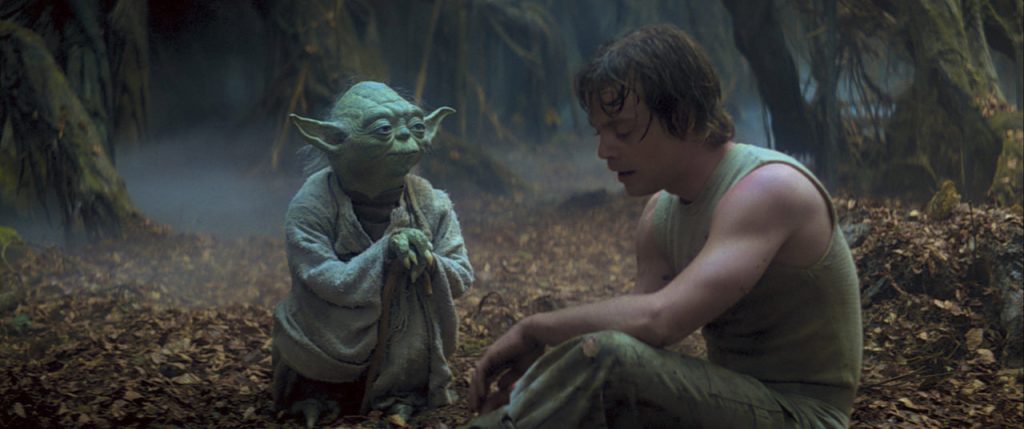
You are Luke Skywalker, we are Yoda!
 Simplifying chaos into a single point.
The number 1 has a lot of significance. It means unity, representing a single or the only entity. 1 is sometimes considered the first of the infinite sequence of natural numbers, it is the first positive integer. A singularity.
A singular point of reference is how we aim to deliver insight gained from disparate data within an organisation we work with.
If I had more time, I would have written a shorter letter
Simplicity is one of our core values. It takes time and effort to simplify things, even writing. In fact, Mark Twain once said, “If I had more time, I would have written a shorter letter” and being able to transform the complex into something simple is an artform.
Through technology, baseone enable change, with a focus on keeping it simple. We are after all living in the twitter era, where people want to know everything in 150 characters.
Our overarching goal is to take all the chaotic data and reduce it into one dashboard of meaning, or singular point of reference. A single data point of knowledge and insight.
As easy as on and off.
The binary system is used by almost all modern computers and computer-based devices as a preferred system of use, because of the simplicity of the language. Binary is either on or off, positive, or negative, and each binary digit is referred to as a bit.
Binary is significant to our meaning as it echoes simplicity and is the core language of data. All code ultimately converts to binary, it is universal. Just like atoms make up everything around us in the real world, everything in the digital world can be broken down into binary.
Another interesting point is that binary is the base2 numbering system, which moves us over nicely to the next section.
Covering all the bases
When you count you use ten digits, zero to nine, the decimal system, known as base 10.
Its popularity as a system of counting is most likely due to the fact that we have 10 fingers. Which makes a lot of sense, right?
However in mathematics, we can use different numbering systems called radix, or bases.
A number base is the number of symbols (digits or letters) or a combination of symbols that a system of counting uses to represent its numbers. They are the foundation for conveying, quantifying, and manipulating data.
The base of any number may be written in subscript beside the number (or superscript). For example, our decimal system is Base10 or Base10. There are lots of base numbering systems out there.
Examples of other commonly used number base systems you might recognise are:
- Base2 – Binary – uses 2 symbols (0,1). It is used for coding on computers.
- Base16 – Hexadecimal – It uses the digits 0 to 9, then the six letters A to F. We use these for colour codes.
- Base60 – Sexagesimal – the numbers 0 to 59, Originated in ancient Sumer and passed to the Babylonians. Used today as the basis of modern circular coordinate system (degrees, minutes, and seconds) and time measuring (minutes, and seconds) by analogy to the rotation of the Earth.
Stay with us here, we are almost at the main point.
So, what is Base1?
Ok so now we understand what “base” and “one” mean, and how our numbering systems work… where does that leave Base one?
Well, as a numbering system, Base1 doesn’t quite exist. But if it did, it would be simple. It would be a single symbol or shape to represent counting and organising data – like drawing tally lines on a wall, or the lines of a bar chart.
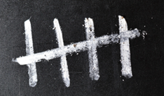

See where we’re going here?
Through Data & Analytics, we provide the foundation (or base) for conveying, quantifying, and manipulating complex data into a simple, easy-to-understand mark, shape or line. We turn something complicated and vast into something simple and easy.
Welcome to the Base1 numbering system. A single simple mark that represents data.
Mic Drop!
Transforming a Story into Visual Design
Now that have the base of our story down, we know who we are, and we’ve delved into semantics a little, we need to move on to look at the actual aspects of visual design that we want to use.
Through a lot of experimentation and exploration, this is how we navigated our visual redesign:
Typeface
First up, we wanted a new font. A font that we could use for the logo, website headers, and generally throughout our brand and marketing. It needed to be serious, but also a little playful and simple. Something that sums us up. Also, we wanted something rounded and binary looking, to tie into our semantic research.
So, we set off in Illustrator, with Adobe, Google, and other font foundries in search of our new superhero typeface.
We wanted a modern, rounded, clean, sans-serif and soon found several fonts we liked. We started to write out the words we needed, letter by letter, in caps, lower case, italic and in different weights. We played with letter spacing, tracking, and leading. We cut, pasted, resized and decided we wanted a rounded “a” so it is more like binary. We compared how much more playful an “s” was in one font than in another. Seriously… we talked about how playful (or serious) the letter “S” could be. It was serious business.
After some time, we settled on Arboria. A font designed by Type-Ø-Tones and downloaded from Adobe fonts. It looks like this:
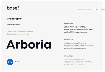
We loved Arboria because it was a chunky Sans-Serif font, with symmetrical bowls and shortened ascenders and descenders. The overall point size wasn’t too far off the x-height or the cap height. Plus, it has a rounded “a”, a balanced “s” and so on.
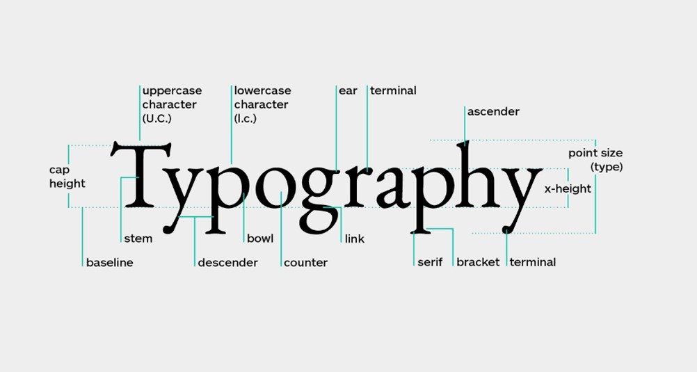
In other words, it was a short, stumpy, solid, rounded, binary looking typeface, and had good flow. Exactly the right mix we were looking for.
Colour and Colour Psychology
We knew what our colours should be based on our service pillars from earlier. We liked our original service colours and wanted to stick to them. But for the main logo and brand image, we wanted a single colour.
We wanted a colour that worked well on dark and white backgrounds. With this in mind, we stuck with the blue colour from our services palette.
Why?
Well, it is our original core colour. Plus, in colour psychology, blue calls to mind feelings of calmness or serenity. It is often described as a peaceful, tranquil, secure, and an orderly colour. Blue is also often seen as a sign of stability and reliability. You will see blue in a lot of corporations because of the sense of wisdom, depth, trust, and loyalty it conveys to the viewer. In fact, blue is often used to decorate offices because research has shown that people are more productive in blue rooms.
So, we have orderly, wisdom, trust, loyalty, professionalism, and productivity. All the things we stand for as consultants wrapped up in a shade. It was the perfect colour choice for us. If we do say so ourselves.
Next, we picked a slightly blue-black colour to fill out our baseone colour palette. These colours worked perfectly together and suited the overall aesthetic we wanted.

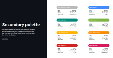
From there, we built out our secondary palette, keeping in mind our service pillars and the requirements for analytics colours. It looked a little something like this:
Pulling It All Together: The Experimentation Stage
The next steps were to create a logo sheet to experiment with what we had so far and lead us towards a final design.
We got to work with our fonts, colours, and semantic meanings, playing with shapes and ideas. We spent hours creating variations and continuing until we really found something we liked.
Here is how our initial logo sheet looked:
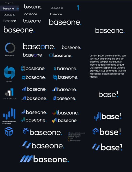
At the top are the some of the font experimentations using the word “baseone” written out. Once we were sure we wanted to go forward with Arboria, we continued exploring the use of symbols.
All the shapes are simple, the fonts rounded, and we kept the full stop from the original logo to become our data point, or singularity. After more deliberation and hard work, we narrowed this down to the following choices:
You’ll notice there was only one with a symbol logo.
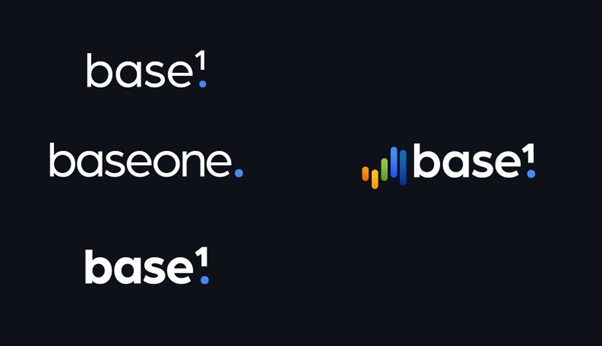
Just so we could “cover all the bases”, we expanded on the symbol to see if an improvement could be made. We really liked the bars as it held so much meaning for us. They added a splash of colour that were colour coded to our service pillars, and also represented a bar chart, which could have also been a gantt chart if you turned it on its side, and it looked like a tally (or the base1 radix).
The expanded version looked like this:
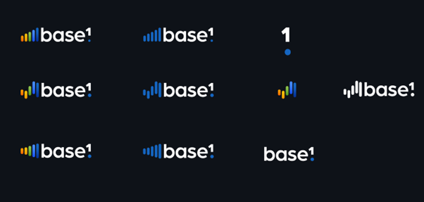
After deciding the original was the best, we went back to the logo with symbol and looked at it in black and white.
The following option uses a simple line chart graphic. It represents our service pillars and the tally numbering system. This was a strong contender:
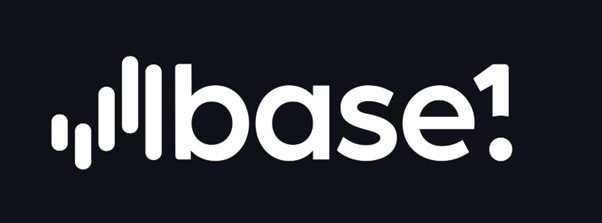
In the end, it was the simplicity that led us to our final and favourite logo ever. All these options and experimentations helped us get to the finishing point and land on our final design.
We decided that the text logo was enough as it was and that an additional symbol wasn’t needed. It had all the symbolism already contained within.
The Symbolism
So how much deep meaning did we pack into our logo. Lets take a look.
Binary looking Font/Typeface
We chose Arboria because it had a good mix of rounded letters. This was good for us, as we wanted to keep simplicity in mind. In addition, things like data, binary, and symmetry needed to play into the completed mark.
In English, there are two types of letter A.
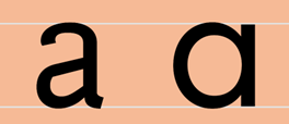
We wanted the rounded “a” to make our type look more like a line of binary symbols. Now we know an “s” doesn’t quite look like zero, but if you squint enough, it is almost there.
The singularity.
We loved the “one” mark on it’s own, as it looks like an exclamation mark, which naturally grabs attention. It incorporated the full stop, which also represented the single point of knowledge, and by making it our blue colour, it added a splash of colour to the logo and made it much more memorable.
Base1 numbering system
We mentioned the numbering systems (or radix) earlier, which is important, as Base1 represents the most simplistic numbering system. Base1 represented transforming complexity into a single shape or pattern, so the superscript 1 logo resonated with us. It also added balance to the overall form.
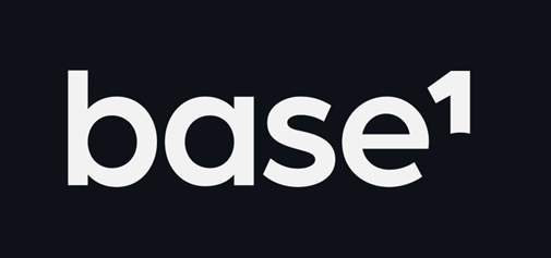
We added in the dot to represent our singularity. It symbolises our approach of keeping things simple, and transforming chaotic data into a single point of information (a KPI, BI report or dashboard).
An exclamation
We liked it at the base of the “1” in our logo, which looks like an exclamation mark, it is punchy, and grabs attention. It completes the overall logo by adding the colour and balancing it out perfectly.
And now for our favourite bit of all.
The Gestalt Principle – Figure/Ground
There are many things to consider when creating a good design, and we absolutely love understanding all of the universal principles that make a design great. In most cases, this is happening subconsciously without the viewers even knowing.
One of these universal principles is the Gestalt Principle, and the figure-ground effect.
The Gestalt Principle is the tendency to perceive information in a way that is automatic and subconscious. It is likely a function of an innate preference for simplicity over complexity, and pattern over randomness.
The human brain is exceptionally good at filling in the blanks in an image and creating a whole that is greater than the sum of its parts. It’s why we see faces in things like tree leaves, clouds, or cracks. This principle is one of the most important underlying ideas behind the gestalt principles of visual perception.
Here are some examples of this in action. If you look at the negative space in the images below, you see other things.
What do you see first? Animals or trees? Faces or Vases?

Quite a few companies have used this principle to subconsciously convey information or ideas or make a logo more memorable. Once you see the image in the negative space, it is impossible to unsee it. You’ll remember it forever when you notice it.
Here’s the logo for FedEx, if you notice between the letters E and X, there is an arrow in the negative space. And this was cleverly placed to represent the movement, flow, speed and transport of items that their business represents.
So, what has this got to do with us you ask?
If you look closely at our logo, specifically at the 1, it partially makes the shapes of a “b” in the negative space. Once you see it, your brain makes up the rest.
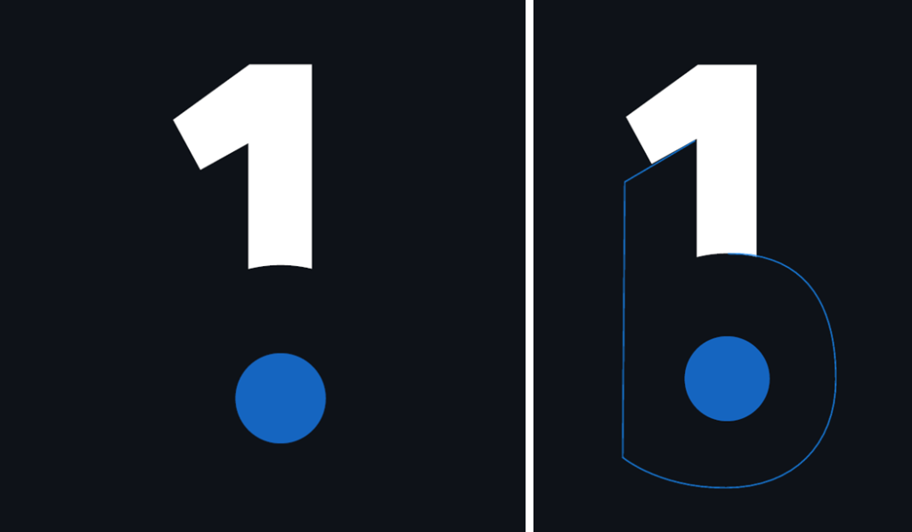
And now we hope you won’t be able to un-see it or forget it.
Final Character Alignment
Finally, we set out to structure the lettering using other principles, such as alignment (every item should be aligned to at least one other item) and to provide additional balance, symmetry and cohesiveness to the overall shape of the logo. We got everything to look straight, balanced, and beautifully simple.
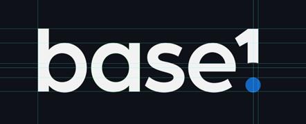
And there we have it! That is our final design.
The Finished Product
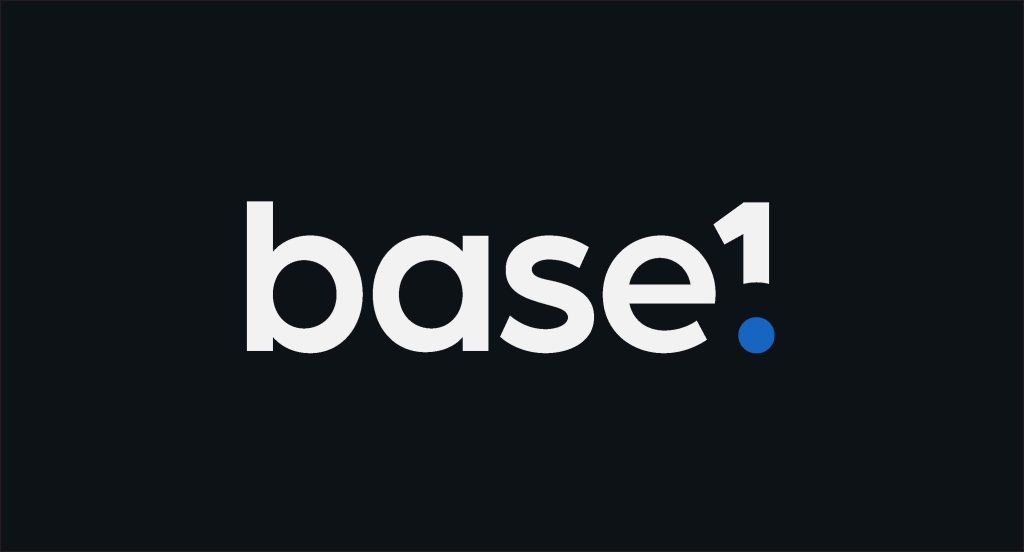
And the one symbol that we really like!
Scoring our logo
Right at the start of this article, we mentioned ARMM and propositional density, so it is time to use these to see how we did, which of course is quite subjective, but this is what we think.
As mentioned previously, there are two types or proposition – surface propositions and deep propositions.
- Surface propositions – describe the visible elements of the logo.
- Deep propositions – Describe the underlying symbolic meanings of a logo.
The propositional density is calculated by dividing the total deep propositions by the number of surface propositions. Or the amount of meaning divided by the number of visual elements used.
Here’s how we scored ours.
Surface propositions
- Text
- The number one
- The blue dot
We have three surface propositions.
Deep propositions
- Binary looking font
- Numbering system reference
- The data point dot
- Number one means first
- Number one means unity or singular
- Number one is universal, and understood by all
- Gestalt – hidden b
- Exclamation mark
So, that’s three surface propositions, and eight deep propositions. Which when divided equals a propositional density of 2.66, which is right up there with some really great logos.
However, you could also argue, that some of the deep meanings we mentioned aren’t apparent to everyone, such as the binary looking font, or the numbering system reference. In which case this leaves the overall score still very high at 2.
Great!
Final Word
What you have here in this article is the story of how we developed our brand, what it means to us and how it translates into the value we deliver to our clients. All through the means of one simple design.
We hope this has shown you the true importance of a logo. A logo is so much more than just a picture. It is an opportunity to capture the essence of a company and bring it to life via visual means.
Hopefully, this story has not only demonstrated how to design a logo for your business, but also demonstrated the care and attention we put into every design choice we make. We are meticulous in what we do and how we do it.
From project controls and data analytics to design and transformation, we strive for perfection and simplicity, to help clients work smarter, react faster and think bigger.
Want to work with us at Baseone? Get in touch to find out even more about what we can do.
Latest posts
Latest insights.
Explore the transformative data analytics trends of 2024 that are reshaping businesses. Discover how augmented analytics, AI, real-time data, and more can drive your organization's success.
Discover how Power BI's visualization tools can transform predictive analytics into actionable insights. Learn about interactive dashboards, custom visuals, and real-time data visualization in Power BI.
